But first, take a look at my old image. That's what it looked like:
I won't lie. I really liked it when I made it. And since I was the one who created it, I was very proud of it. But you know it's nice for the beginning. Once you've figured out you want to have a business and that you want to be serious about it, you should consider upgrading and have an expert handle this. After all it's the image your giving to your clients, right?
Well, I decided it was time for that change. I wanted to give a good impression to my clients. Professionalism, cleanliness and reflect my jewelry: Stylish, modern and rustic at the same time. So I contacted this shop, gave her a little background and what I wanted and she prepared me this stunning new image
Here's the banner only
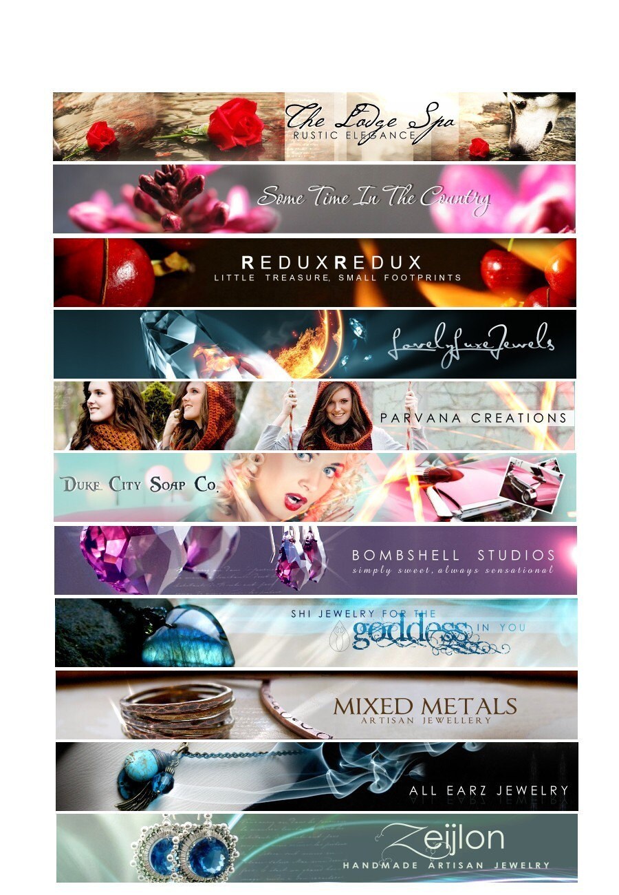
So what do you think? Isn't it gorgeous? I think it reflects exactly what I wanted. It's like she read my mind and created the perfect image for me. Well, that's why she's so successful as well. There are many businesses that have hired her and she just does a great job. Her shop is Winchester Lambourne Here are a few other designs she has made.
Picture by Winchester Lambourne
Anyway, I'm very excited about the new look of my shop. So, please make sure to check it out I would appreciate your comments!!! Hope you like it :)


Your jewelry is beautiful! Your shop looks wonderful!
ReplyDeleteGreat job! Looks fantastic!
ReplyDeleteI agree, looks fantastic. I love the look of your blog as well.
ReplyDeleteGorgeous makeover! I can see why you waited - she has an awesome portfolio.
ReplyDeleteLove the new banner and the piece you used in it is gorgeous.
ReplyDeleteI followed you from my blog. Love the background you used in yours...very classy shabby. :)
Thanks everyone!
ReplyDeleteWhat an awesome banner - It works very well with the feel of your shop too!
ReplyDelete